With the podcasting space growing more competitive every day (there are over 5 million podcasts currently!), your podcast branding has never been more important. A logo isn’t just a pretty graphic; it’s the face of your brand, the first thing a potential listener sees before deciding to click play or scroll past. A well-designed logo suggests your level of professionalism and expertise, and helps create quick recognition. But what separates a forgettable logo from an iconic one?
After reviewing hundreds of successful podcast logos, we’ve found that they all share five common traits. Whether you’re creating a new show or updating an old brand, these guidelines will help you design a logo that stands out in crowded app stores and connects with your customers.
Keep reading!
Consistency Across Branding
Your podcast logo doesn’t exist in a vacuum. Your logo is just one part of something bigger, which also involves your website, social media profiles, merchandise, and audio branding (also known as intro music). When you are consistent throughout your content, consumers recognize where it’s coming from, regardless of where they see it.
Why Consistency Matters?
- Brand Recognition:Think of a global brand like Apple or Nike. Their logos are maintained consistently on all platforms. Podcasts operate on the same principle. The Joe Rogan Experience has a loud minimalist logo on YouTube, Spotify and Instagram, which doesn’t change in any context, so is easily recognisable.
- Branding that doesn’t match :the colors or style indicates unprofessional behavior. Listeners equate visual cohesion with content quality.
- Same tone as your podcast :by repeated use of colors and pictures. A true crime series may have darker, moody colors, while a comedy podcast may use cheerful, bright colors.
How to Achieve Consistency?
- Pick 2-3 colors that represent your podcast’s personality (the main colors). Tools like Coolors.co can help you generate harmonious palettes.
- Keep your fonts to 1-2 types: use one strong sans-serif font for the title and a simple serif font for subtitles. Avoid using very fancy fonts that make the text on thumbnails unreadable.
- Use recurring symbols or motifs in your imagery. For instance, Serial uses a vintage microphone as part of its logo to reflect investigative journalism.
- Your logo needs to be adaptable for square (podcast apps), horizontal (YouTube banners), and circular (social media profiles).
Pro Tip. Pair your visual branding with consistent audio elements. Use Tempolor’s AI Music Generator to create intros/outros that match your logo’s vibe.
Point to the Topic
A great podcast logo tells a story at a glance. Before readers even see your title or description, they should have a clear sense of the show’s genre, tone, or niche. This is particularly significant in app directories like Apple Podcasts, where people look at numerous thumbnails.
Balancing Literal and Abstract Imagery
- Use symbols that are directly related to your topic. A circuit board could make its way into a tech podcast, while a historical show may use vintage maps or parchment. The Science Vs podcast has a logo that features a cartoon microphone fighting a DNA strand. This logo hints at the show’s approach to debunking various myths.
- Use colours and shapes to stimulate emotions that express the broader or conceptual aspects of the artwork. A mental health podcast might use soft, flowing lines and relaxing blues.
Case Study: My Favorite Murder
The blood-red mic of My Favorite Murder looks like a microbe with a knife stabbed in it. The show is about crime storytelling, with laughter always included alongside it. The image is simple yet instantly communicates the show’s theme.
Avoiding Misleading Imagery
Using generic icons (e.g., meaning a microphone) can easily become a mistake for your show. If your podcast discusses vegan cooking, include a plant or chef’s knife instead of a primary mic.
Pro Tip. Use Tempolor’s Song Maker to design a theme song that aligns with your logo’s narrative.
Add a Personal Touch
Podcasts thrive on intimacy. Listeners love this host’s view, so your logo needs to reflect that identity. Your brand will feel humanized with a personal touch.
Ways to Infuse Personality
- Include a kick-ass illustration or photo of the host or hosts. The Michelle Obama Podcast gives a real-life portrayal of the former first lady, showing that she is not so big.
- If your show has a running gag, throw it in a subtle reference. The comedy podcast My Brother, My Brother, and Me features cartoon microphones! The microphones have distinct attributes that resemble the hosts.
- Hand-drawn fonts/doodles add warmth.
“The title of the project ‘Terrible, Thanks for Asking’ is handwritten, making it look terribly messy.”
Case Study: Armchair Expert
Dax Shepard’s Armchair Expert logo represents a comfy armchair with a vintage microphone. The design is conversational and friendly, just like the show’s interviews.
Pro Tip. When you’re camera-shy, use mascots or abstract shapes that are friendly to you. A productivity podcast, for instance, might choose a rocket or hourglass icon.
Keep the Components Simple
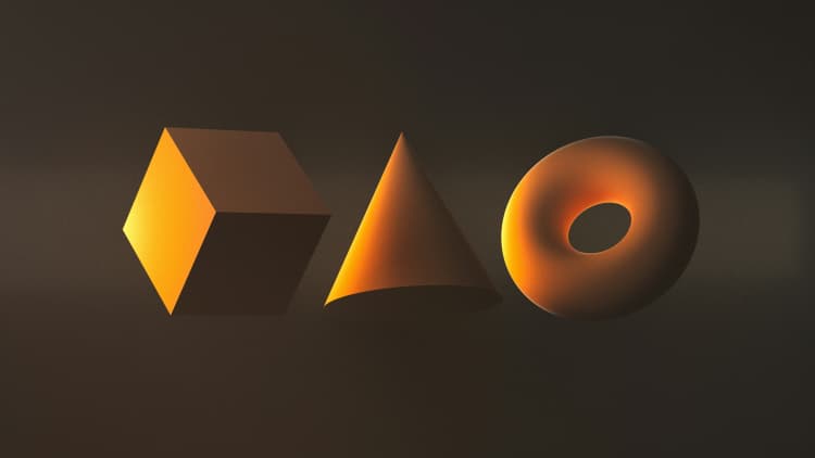
Less is more in logo design. Overly complex logos become indecipherable at small sizes, such as on smartphone screens, and fail to leave a lasting impression. Simplicity ensures clarity and versatility.
Principles of Minimalist Design
- Negative Space: Use space to guide the eye. The Freakonomics Radio logo cleverly embeds a dollar sign within a soundwave, conveying economics and audio in a glance.
- Limited Details: Avoid intricate patterns or tiny text. The Daily by The New York Times features a stark black-and-white design with a bold “D,” ensuring readability even as a 100×100 pixel thumbnail.
- Scalability: Test your logo at different sizes. If it’s unreadable on a smartwatch, simplify further.
The Power of Monochrome
A simple logo works well in both color and black and white. Radiolab’s logo—a glowing orb—is recognizable even without its signature purple hue.
Pro Tip: Use Tempolor’s Create Music tool to design minimalist audio cues that complement your logo.
Value Image Quality
A pixelated or poorly formatted logo undermines your credibility. High-resolution files and proper technical specs are non-negotiable.
Technical Must-Haves
- Resolution: Use vector files (SVG, EPS) for scalability. Raster images (PNG, JPEG) should be at least 3000 x 3000 pixels for Apple Podcasts.
- Transparency: Provide a PNG with a transparent background for flexibility.
- File Formats: Save multiple versions (color, black and white, simplified) for different use cases.
Common Pitfalls
- Pixelation: Caused by upscaling low-res images. Always start with a vector.
- Overcompression: JPEG artifacts make logos look blurry. Use PNG for lossless quality.
- Incorrect Dimensions: Square (1:1) logos are standard, but ensure they’re centered for cropped displays.
Pro Tip: Hire a professional designer or use tools like Canva to export print-ready files.
Conclusion
Your podcast’s logo is like a handshake. A podcaster’s logo needs to attract listeners at a glance. Use consistency, clarity, personality, simplicity, and quality; we’ll create a logo design that will become synonymous with your brand and make you stand out from the competition.
Remember, your logo is just one piece of the puzzle. Pair it with high-quality audio, engaging content, and tools like Tempolor’s AI Music Generator or Song Maker to build a truly unforgettable podcast. Ready to start designing? Head to Create Music and craft a brand that resonates.
Learn more:What is A B Thumbnail Youtube Testing And How to Use?
